文本框介绍(Introduction to TextField)
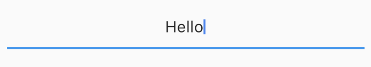
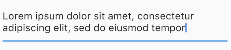
TextField组件允许收集用户的信息,TextField基本的代码简单的如下:
1 | TextField() |
这个创建一个基本的TextField:
从文本框检索信息(Retrieving information from a TextField)
由于文本框在Android中没有ID,所以文本不能按需索引,相反在更改时保存到一个变量中,或使用一个控制器。
最简单的方法是使用onChanged方法并将当前值存储在一个简单的变量中。下面是它的示例代码:
1
2
3
4
5
6
String value = "";
TextField(
onChanged: (text) {
value = text;
}
)第二种方式是使用TextEditingController,这个控制被附加在该文本框中,监听同时控制文本框的文本。
1
2
3
4
TextEditingController controller = TextEditingController();
TextField(
controller: controller,
)使用下面代码来监听变化:
1
2
3
controller.addListener(() {
// Do something here
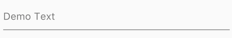
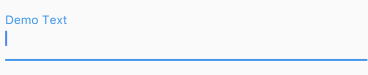
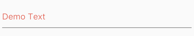
});获取/设置值:
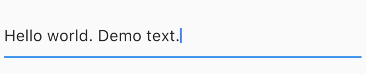
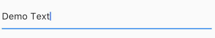
1
2
print(controller.text);
controller.text = "Demo Text";
文本框其他回调 (Other callbacks from the TextField)
该组件也提供其他回调,诸如:
- onEditingCompleted
- onSubmitted
1 | onEditingComplete: () {}, |
这些回调在像这些动作上调用,如当用户在iOS上点击“done”按钮。
在文本框中使用焦点(Working with focus in TextFields)
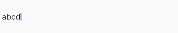
“焦点”存在文本框上,意味着文本框处于活跃状态,键盘上任何键入将会将数据输入到焦点文本框中。
使用自动获取焦点
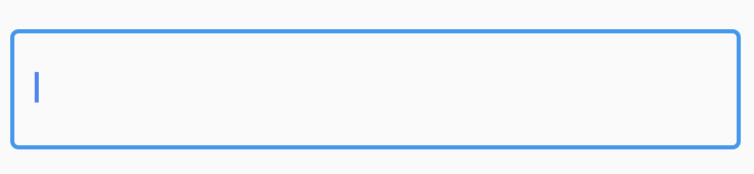
为了在组件创建的时候,文本框自动获取焦点,设置autofocus为true。
1 | TextField( |
这默认将焦点设置在文本框上。
使用自定义的焦点变化
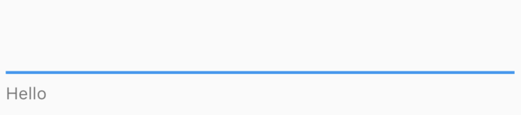
如果我们想按需变更焦点而不是自动获取焦点,该如何做呢?因为我们需要以某种方式来引用下一个我们想要获取焦点的文本框,我们需要附加一个FocusNode到TextField中,用它来进行切换焦点。
1 | // Initialise outside the build method |
我们创建了两个焦点节点,并将它们附加到文本框中。当按钮按下的时候,我们使用FocusScope来请求下一个文本框获取焦点。
更改文本框的键盘属性(Changing Keyboard Properties for TextFields)
Flutter中的TextField允许您定制与键盘相关的属性。
Keyboard Type
TextField允许你自定义keyboard的类型,当TextField进入焦点中时显示。我们可以向下面这样变更keyboardType属性。
1 | TextField( |
其类型包括:
- TextInputType.text (Normal complete keyboard)
- TextInputType.number (A numerical keyboard)
- TextInputType.emailAddress (Normal keyboard with an “@”)
- TextInputType.datetime (Numerical keyboard with a “/” and “:”)
- TextInputType.multiline (Numerical keyboard with options to enabled signed and decimal mode)
TextInputAction
变更TextField的textInputAction会让你改变键盘本身的动作按钮。
例如:
1 | TextField( |
这会导致“Done”按钮被“Continue”按钮替换。
1 | TextField( |
这会导致“Done”按钮被“Send”按钮替换。
完整的列表太大,不能在这里显示,但是一定要检查它。
Autocorrect
启用或禁用对特定TextField的自动更正。使用autocorrect进行设置。
1 | TextField( |
这也将禁用建议提示。
Text Capitalization
TextField提供了一些选项用于关于如何输入中大写用户输入的字母。
1 | TextField( |
类型包括:
TextCapitalization.sentences
这是我们预计的正常的大写形式,每个句子的首字母都要大写。
TextCapitalization.characters
所有字符大写。
TextCapitalization.words
每个单词的首字母大写。
文本样式,对齐以及光标选项(Text Style, Alignment and Cursor Options)
Flutter允许TextField中的文本样式,文对齐方式,以及光标进行自定义。
文本对齐
使用textAligin属性在光标在TextField在哪里显示。
1 | TextField( |
这会导致光标和文本在文本框的中间显示。
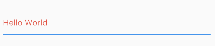
文本样式
使用style属性来更改文本的外观样式,使用它变更颜色,字体大小,这个类似于Text组件的style属性。
1 | TextField( |
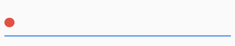
自定义光标
在TextField组件中是可以直接自定义的。
允许你改变光标的颜色,宽度,边框角的弧度。例如,这里弄了一个圆形的红色光标。
1 | TextField( |
控制大小和最大长度(Controlling the Size and Maximum Length in a TextField)
可以控制TextField中写入的最大字符数、最大行数,以及在输入文本时展开。
控制最大字符数
1 | TextField( |
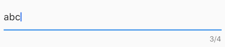
通过设置maxLength属性,将强制最大长度,并在默认情况下向TextField添加计数器。
可伸缩的文本框
某些时候,我们需要一个TextField在一行结束的时候能够扩展。这个在Flutter有点奇怪,但是很简单。为此,我们设置maxLines为null,默认是1。我们不太习惯设置null,但不过很容易搞定。
注意:将maxLines设置为一个直接值,默认情况下会将展开到指定的行数。
1 | TextField( |
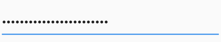
模糊文本 (Obscuring Text)
为了模糊文本,设置obscureText为true。
1 | TextField( |
最后,装饰文本框(And Finally, Decorating the TextField)
Flutter为了装饰TextField,我们使用decoration属性,接收一个InputDecoration。因为这个InputDecoration类很庞大,让我们尝试快速浏览其大部分重要的属性。
使用hint和label属性向用户提供信息提示
hint和label均为字符串,用于帮助用户理解输入到文本框的信息。不同的是一旦用户开始输入,hint会消失,而标签将会向上浮动。
使用“icon”,“prefixIcon”,“suffixIcon”添加图标
你可以向TextFields直接添加图标,你也可以使用prefixText和suffixText添加文本。
1 | TextField( |
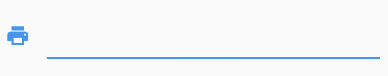
1 | TextField( |
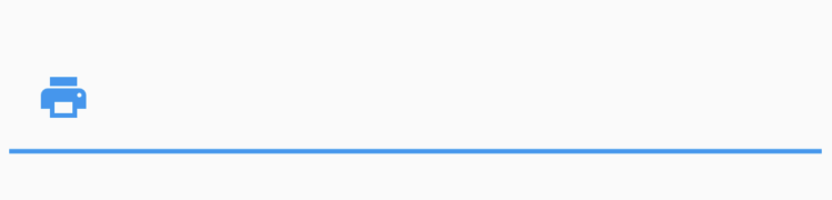
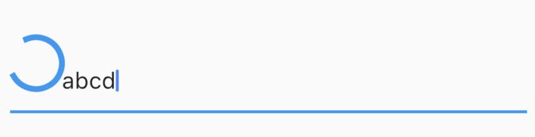
类似的其他任何组件,使用“prefix”,而非“prefixIcon”
1 | TextField( |
为了使用通用的组件,而不是图片,应该使用prefix字段。
1 | TextField( |
像hint,label等等这样的属性,每个都有相应的style字段
为了添加hint样式,使用hintStyle,为了添加label样式,使用labelStyle。
1 | TextField( |
如果你不想要标签,但仍为用户保留信息,使用“helperText”
1 | TextField( |
使用“decoration:null”或“InputDecoraion.collapsed”来移除默认下划线
1 | TextField( |
使用“border”添加一个边框
1 | TextField( |
还有大量的修饰你可以深入去做,可是我们不能在一篇文章中讨论所有内容。但我希望这能让你清楚地了解自定义Flutter的TextField是多么地简单。